My Nokia Blog |
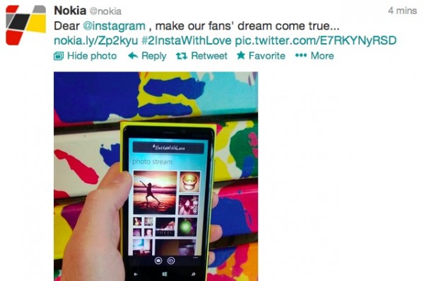
- @Nokia fans loving #2InstaWithLove, Nokia putting more ‘pressure’ on @instagram to bring it to Lumia
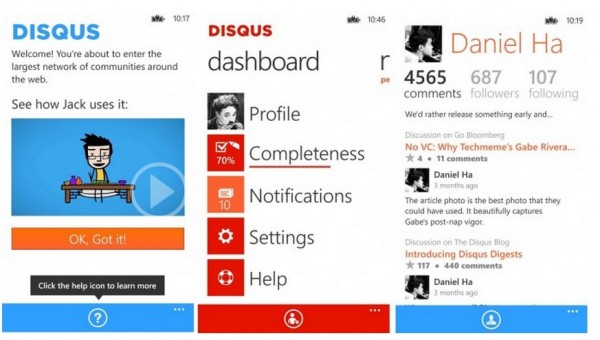
- Disqus releases app for Windows Phone first. No plans yet for iOS/Android?
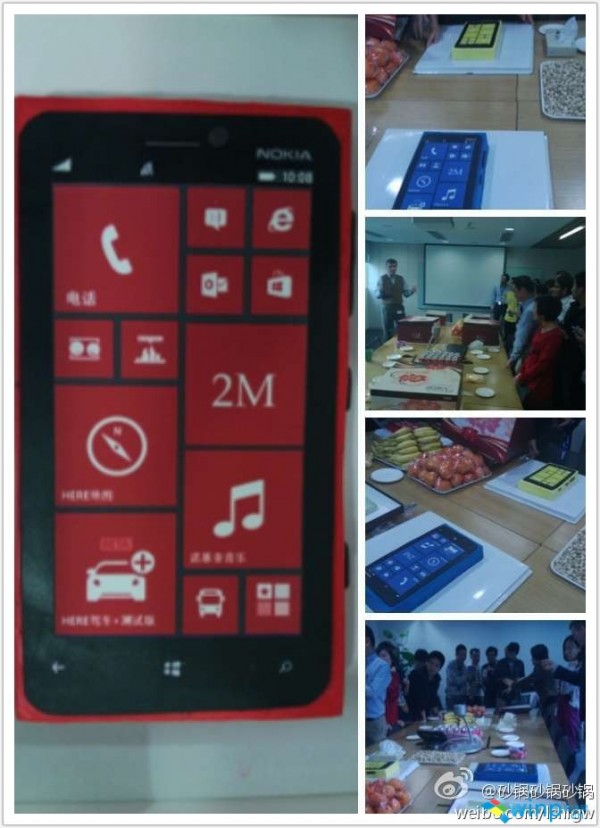
- 2 Million Nokia Lumias sold in China in 3 months? Or Not? Either way Lumia cakes in celebration!
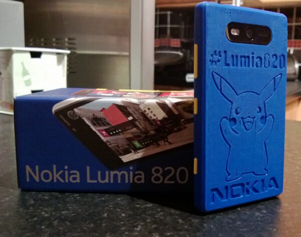
- Awesome Pikachu 3D-Printed Lumia 820 shell
- Notification Center Concept: Hyperspace
| @Nokia fans loving #2InstaWithLove, Nokia putting more ‘pressure’ on @instagram to bring it to Lumia Posted: 06 Mar 2013 12:07 PM PST Instagram on WP/Nokia Lumia. It has been dragged out a lot, no? Will it, won’t it, when will it appear? Nokia’s been rather too obvious now that Instagram is definitely coming to Nokia Lumia.
https://twitter.com/nokia/status/309390694378766336 Whilst some see it as Nokia begging Instagram, others have said it’s likely that this is just to drum up hype for when Instagram eventually appears on the WP/Nokia Lumia platform. Why would they have so much fuss over something so uncertain? A good timing as some have suggested is to coincide with the release of the EOS to really ramp up the whole Image focus of Nokia. _______________ To reiterate, Instagram is not really just about the filters. It’s about the sharing of photos with an audience, it’s about connecting with others through photos, commenting on pictures, liking them, following other folks who share pictures you’re interested in. Some people share their work/portfolio, some share their life through photos. And BTW, as nice as the multitude of filters are, who says you need to upload pictures that are edited? Nokia fans have been long known to produce some of if not the best raw, unedited mobile phone photography on the planet. You could do the same for Instagram. _______________ Related posts:
|
| Disqus releases app for Windows Phone first. No plans yet for iOS/Android? Posted: 06 Mar 2013 10:19 AM PST
Somewhat more interesting is that some how there isn’t yet one for iOS or Android. You can pick this up here. WPC says the app was developed in-house from the Disqus team and that there are currently no plans for an iOS or Android version (although they’ll probably defo come in time).
Source: WPC
|
| 2 Million Nokia Lumias sold in China in 3 months? Or Not? Either way Lumia cakes in celebration! Posted: 06 Mar 2013 09:40 AM PST
Reports are going around that 2 Million Nokia Lumias had been sold in China alone between December 5th 2012 and March 5th 2012, a span of 3 months. Ideally, there’d be quite a lot less sold during December so it would bump up Q1 2013. The demand was said to be high, particularly of the 920 and suggested activation numbers would have been higher if supply was better. The cakes seen above were made in small celebration. Both the 720 and very budget friendly 520 is apparently coming in the next few weeks. Update: Apparently before even publishing there are denials of this number from WPC (Who loves to retort things in a matter-of-fact ways) and indicates that 2M apparently does not stand for 2 million. Cheers Viipottaja and meh for the tip! |
| Awesome Pikachu 3D-Printed Lumia 820 shell Posted: 06 Mar 2013 04:15 AM PST Ali showed us the 3D printed My Nokia Blog shell Nokia Connects gave him at MWC. They also made me my own. Anyway, the coolest one by far is the one below, owned by@Psychomania666. I think what I find the coolest about this is the fact that the buttons are yellow! Obviously the only thing better would be if it were coloured yellow and Pikachu was coloured in, but hey, beggers can’t be choosers!
|
| Notification Center Concept: Hyperspace Posted: 05 Mar 2013 11:18 PM PST One very popular feature request for Windows Phone that keeps coming up is a need for a notification center. While it can be debated if such feature is actually needed in the first place, the demand for one can't be denied. Many people absolutely want notification center and Microsoft has admitted of working on one, or at least considering it. While I believe Microsoft will be choosing something simple for their implementation of notification center like adding it in the Me tile or making a new specialized notifications app and a tile for it, it's still fun to try visualizing possible solutions. WP community has made numerous concepts around this topic so I felt like trying to do one too. I also wanted to make a user interface design exercise out of this by adding some constraints and special requirements to make it more interesting:
1) It has to offer a new angle to notifications Basically just have some new idea for one instead of rehashing something old. 2) It has to be accessible from any screen without visual interruptions User should be able to summon notification screen or otherwise access it with minimal navigation. This requirement for example disqualifies anything that involves going back to Start screen first as that involves a transition through black screen (something that I count as an interruption). Users should also be able to return to where they were with a single tap of the back button. 3) It has to have a complementary function to the Live Tiles instead of parallel Notification center in WP shouldn’t be something that competes directly against Live Tiles and their purpose. It should not offer just an alternative mean to access notifications but preferably work together with Live Tiles and all the other currently established notification methods like toast notifications and lock screen. 4) It has to look distinctively Windows Phone This is a no-brainer but deserves still a point of its own.
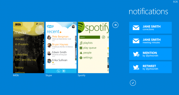
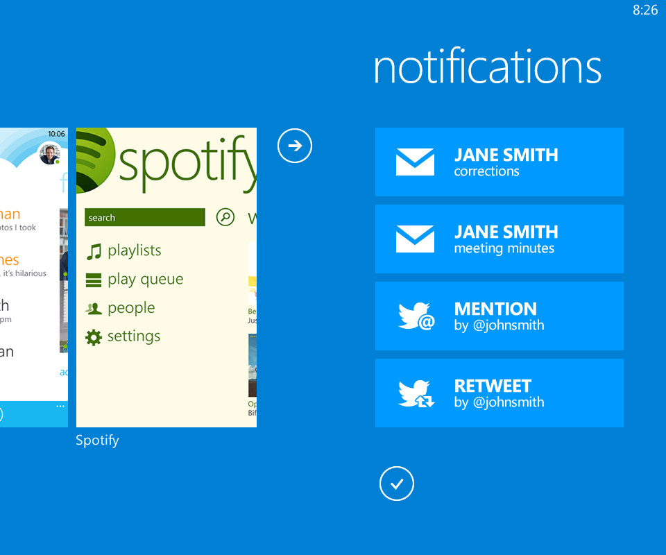
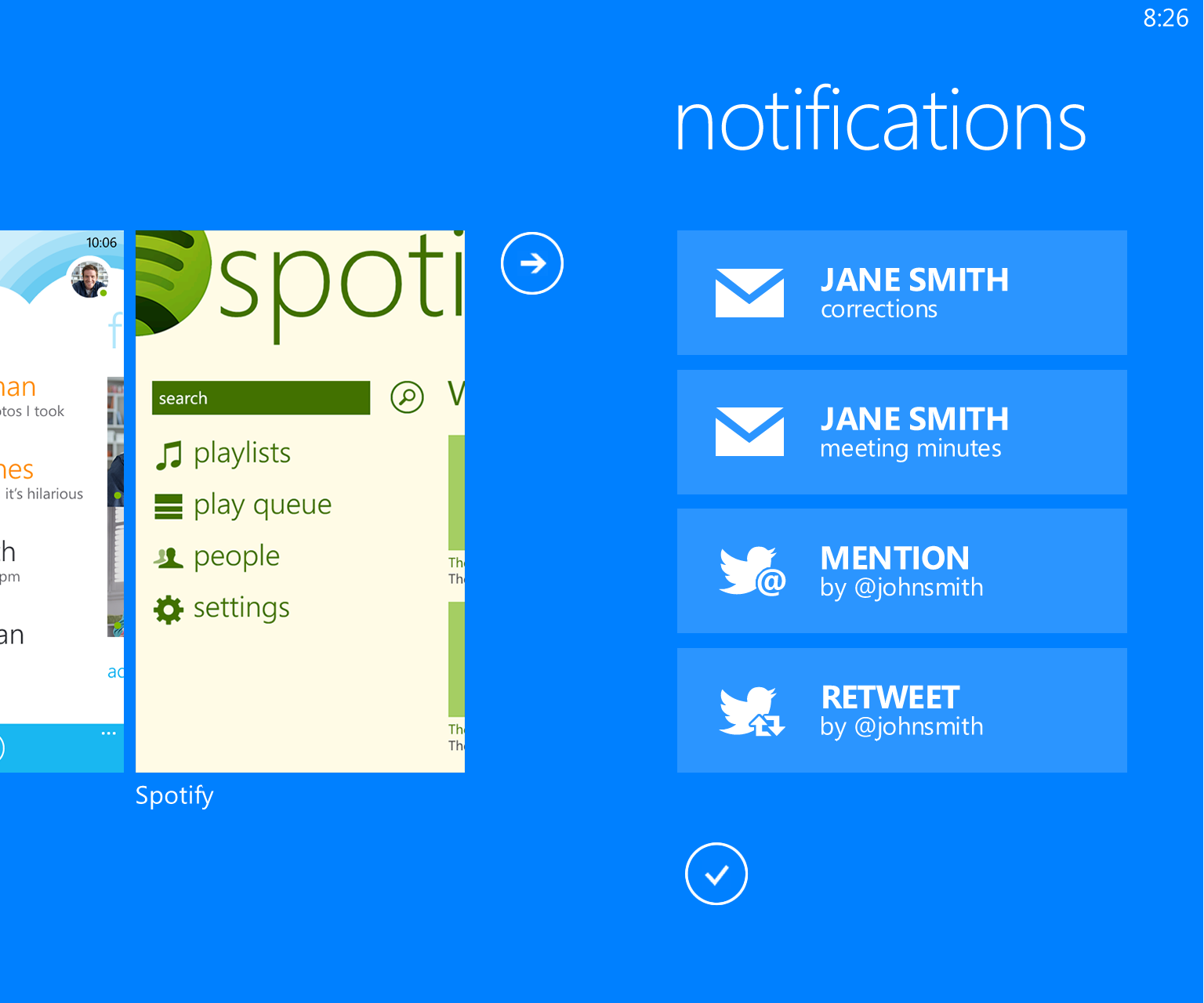
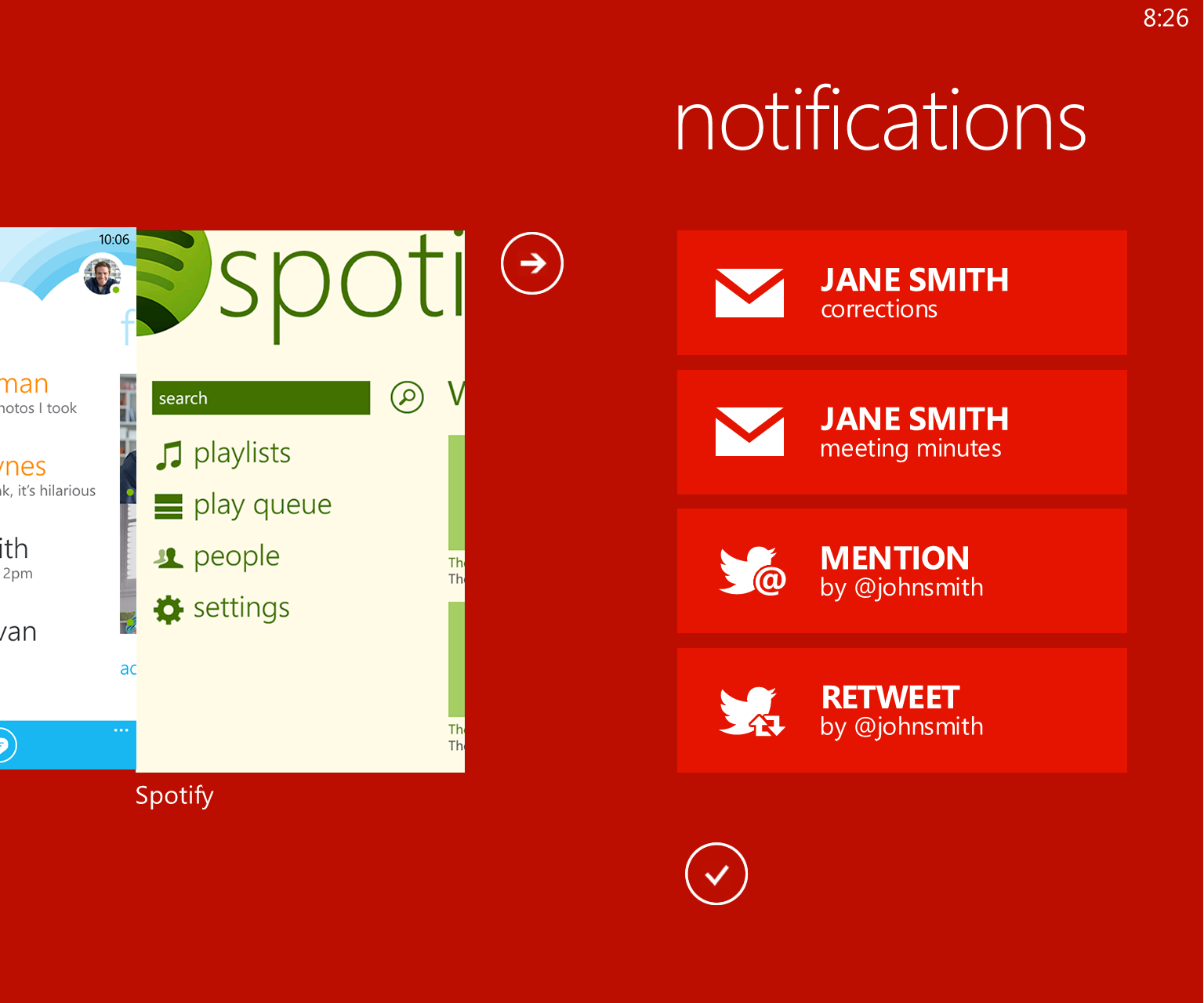
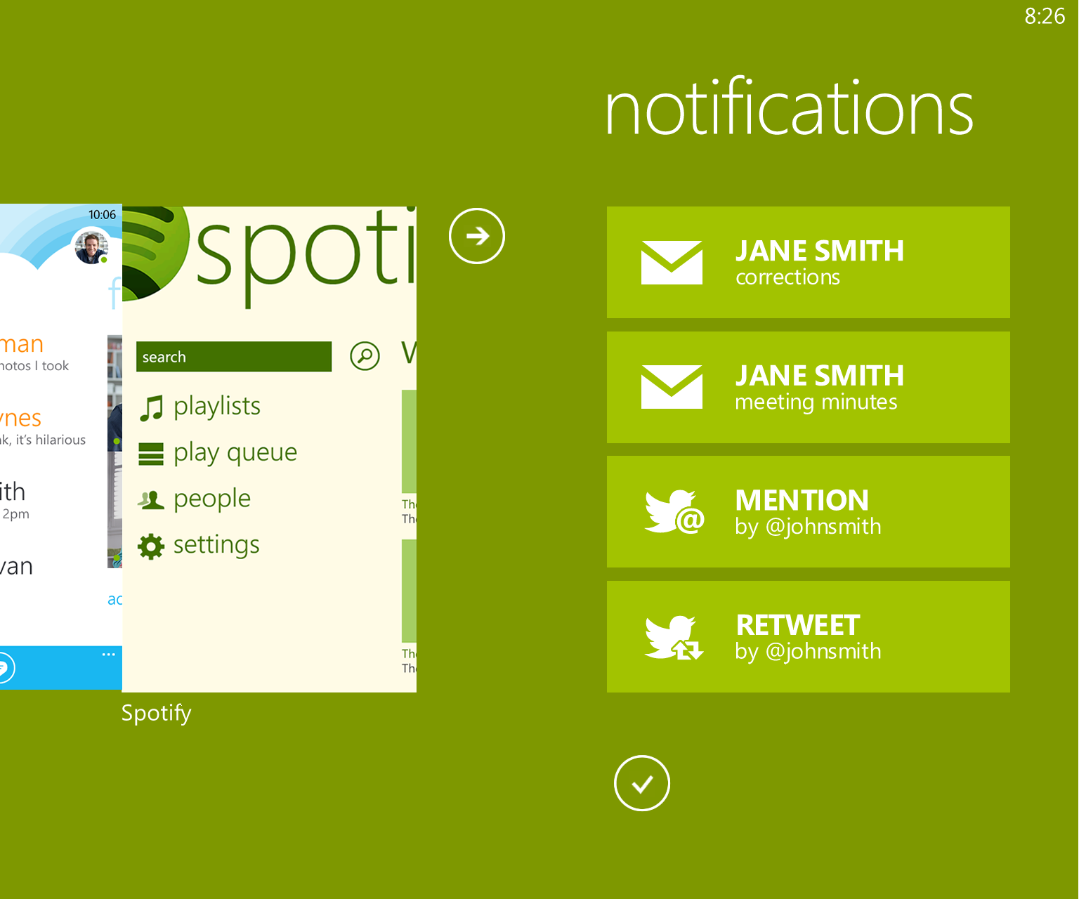
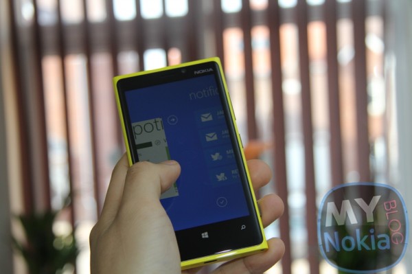
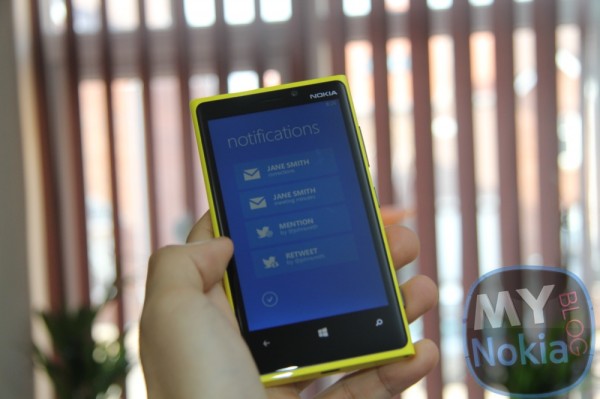
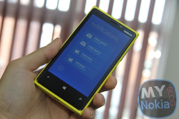
I took all of these points in consideration and proceeded to try figure out something and this is what I come up with: Notification center concept: HyperspaceIn this concept, notification center is placed in the same space where multitasking cards can be found, accessible by long press of the back button. For some reason I’ve always thought this space similar to how hyperspace is described in sci-fi movies, an inter-dimensional space that can be used to fast travel to other parts of the space, in this context to other open applications. Because of this I eventually started calling this concept "Hyperspace" and the name stuck. The notification center would be positioned right from the application cards (arrow icon placed as a visual cue), accessible by a flick to the left which will reveal all unattended notification items from all installed applications in a scrolling vertical list. Many of the arguments supporting notification center have been about a need for a place to find all the missed toast notifications which has been an inspiration for this concept. When we get a Toast notification, we'll either tap it for accessing it or swipe it away from the screen. When we do the latter and discard a Toast, it will fly away to the right side of the screen… where the notification screen in this concept is also positioned. Because of this behavior you can think that if you miss a Toast, it will just be automatically discarded to the notification center on the right. (Note: Alternative name for this concept was "Toast Rack")
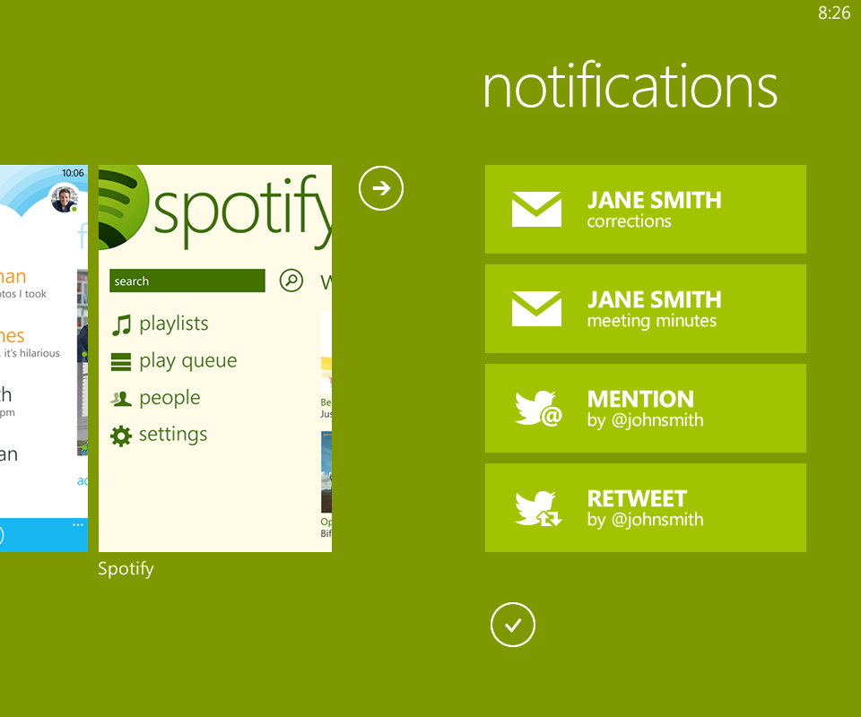
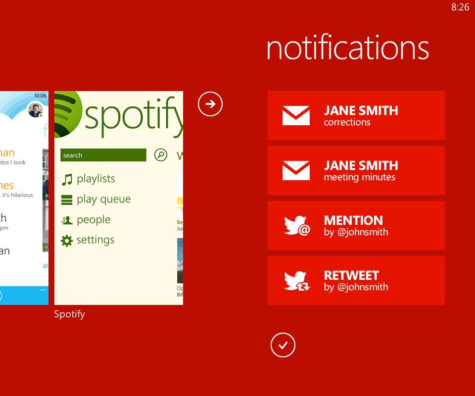
[WARNING - BORING AND LONG DESCRIPTION PARAGRAPH] While the notification items have some resemblance to the actual Toast notifications, they don't look exactly like them anymore for two reasons. Firstly, Toast notifications are really designed to work as singular units, to be read one at a time and not as a list. I did try this concept with stock Toast notifications but that did not work out well. The end result was a wall of small text that looked like crap. Secondly, Toast Notification appearance is designed to be subdued and non-intrusive, something that is not a priority number one for notification visuals in a screen especially dedicated to them. The appearance I end up choosing for notification center and the items comes from my personal preference regarding notifications which is that they should focus on the notifying part instead of trying to give out as much information as possible. In practice this means big icons, large title texts and lots of negative space to make the individual notifications pop up in glance-sized bits, avoiding at all costs that wall of text -feel that plagues notification centers in other operating systems. In my example you can see one way to accomplish that, instead of trying to cram as much info as possible in items, I focus only on the essential information and that's it. I decided to use the accent color for the items as the multitasking screen already uses a bit darker shade of the accent color so the items will match the background color by default. Some other color might’ve been more optimal, but this solution is so effortless and works with any accent color I decided to go with it. I also had an idea going that maybe the items could flip in timed intervals revealing more information about the item in the same manner as Live Tiles do but I felt it going too much in territory of the Tiles in the end. I don't believe there should be any advanced features like notification history or search; the purpose of this center would be just to make sure you don't miss anything. When you access a notification from the center or the corresponding Live Tile, it will be gone. If user wants to clear all the notifications, there's a button for that in the bottom.
Now let's see if I managed to hold my own requirements. 1) Check. I haven't seen any other concept exploring this possibility. It's new to me at least. 2) Check. When you press and hold the back button, screen zooms out without visual interruptions (long press is kind of an interruption though if not visual one) and with a quick flick you're in the notification center Nice perk with this implementation is that you can return to your original application with a single tap of the back button, and once again without visual interruptions. 3) Check. The concept does not try to eclipse Live Tiles but works in a distinct space with a purpose of its own. 4) Check. I think.
Now, if you want to try how this would look in a real device feel free to download some of these pictures and look them using the Photos application. You can also scan the QR code next to a pic to get the image. 800 x 480
1280 x 768
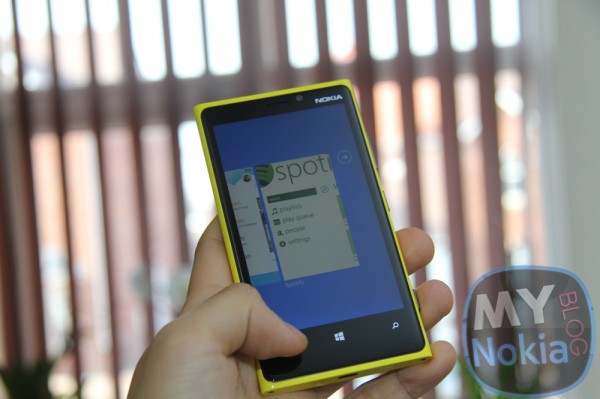
Notification center in action
Like always, comments and critique are welcomed. I do these to learn. |
| You are subscribed to email updates from My Nokia Blog To stop receiving these emails, you may unsubscribe now. | Email delivery powered by Google |
| Google Inc., 20 West Kinzie, Chicago IL USA 60610 | |







No comments:
Post a Comment